
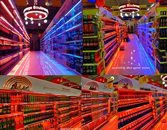
Back in the days when lighting was not predominantly used in trade, we already ventured into the play of lights for this project. This was to support our objective of making the beverage section more appealing. We rationalized that a more attractive section and one that provided easy shopping navigation would influence greater visits among shoppers and eventually help turn the category into a destination area.
Going beyond the look, we used the lighting system as a directional component of the design by employing a color coding system for the product mix length and depth. We used red to represent cola, blue for water, green for tea and orange for juice.
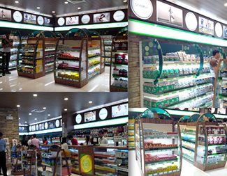
It was a call for both a premium look but still a warm feel for Pure Pharmacy Health section. This was to be the 1st of its kind in their line up of store dress up.
The use of acrylic, lighting, wooden and stone textures as accents, not to mention some fitting visuals and the right amount of branding put together an inviting and upscale atmosphere that supported a health and wellness communication in the section. The end look from design concept to execution provided a big and targeted transformation to the category. It exceeded our partner’s expectations.
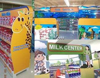
Extending our reach outside of NCR and Luzon, these projects represent our rich line up of milk solution center requirements. Some of the dress ups include the gondola design, others the endcap and headers too. While a solution center concept may support a general theme, it has to be uniquely applied in each and every store so that the specific store’s personality is sustained. This will continue to differentiate it from the competitors and even among its family branches. A solution center project normally extends to fabrication and installation.
As with Gaisano Casuntingan (see the left and upper part of the image), the animal print supported a safari theme and the layouts and the color mix were made to complete the youthful and fun look. Stickers at the walls and all other substrates made use of a large format direct printing technology.
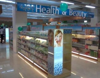
This was one of our early designs and executions for a beauty care section. The header, end cap and the base lighting were among those that made up the dress up requirement. As the beauty section would always be aspirational, the idea was to softly promote outer beauty but with greater emphasis on the resulting glow that emanates from within. This was the kind of look that was to be promoted by the visuals from models to the structural prints and designs. And so, there was a conscious use of soft hues, managed lighting, appropriate layout for prints and layers of wooden textures.
11FTC is the leading Retail Marketing Solutions Provider and an up-and-coming Shopper Marketing Services Company that has a proven track record in below the line advertising since 1996.


Copyright 2018. 11FTC All Rights Reserved